shop.erinwong.design
Migrating off Etsy & into a storefront domain coded with HTML, CSS, and basic Javascript
#web development #UI design #e-commerce
I. INTRO
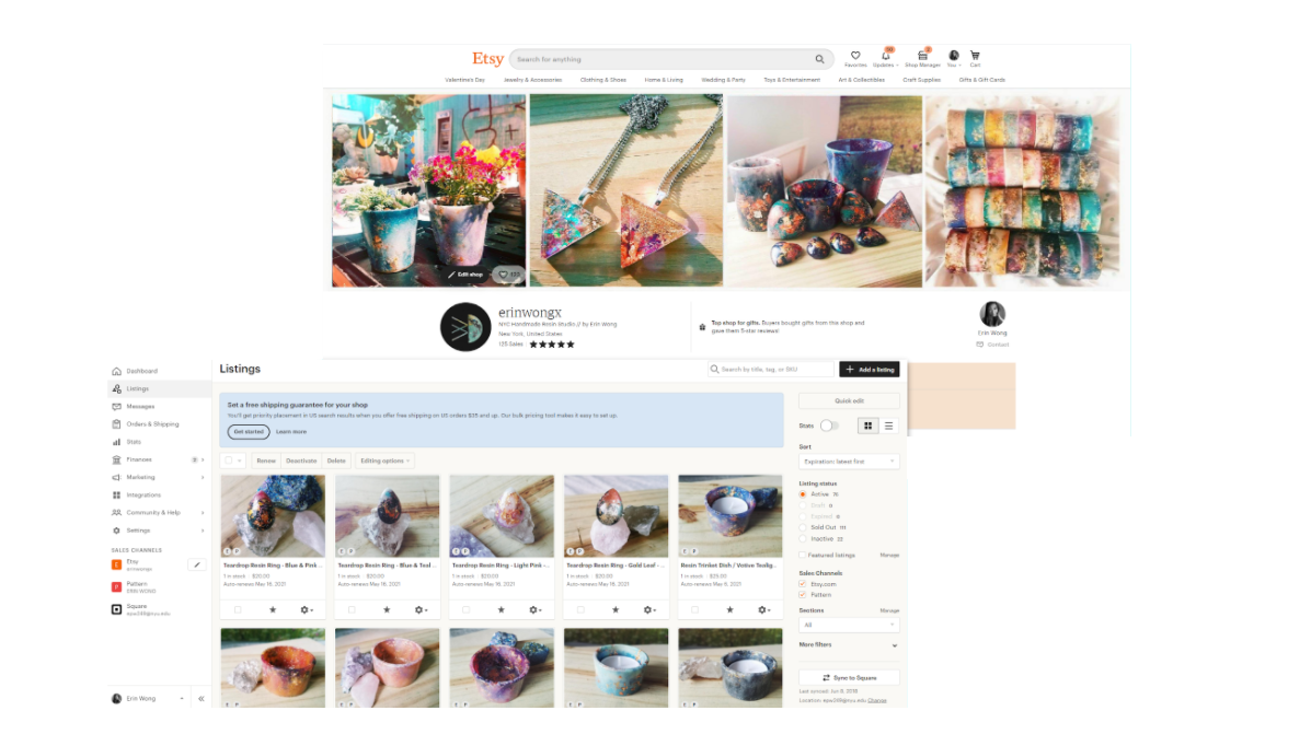
As a hobby on the side, I enjoy making handcrafted jewelry and art, and I like to list my wares for sale on Etsy.
TOOLS
Adobe XD, VSCode, InVision
II. USER RESEARCH
I created two surveys, one for Etsy sellers and one for for buyers, and reached out to folks on Reddit for their input.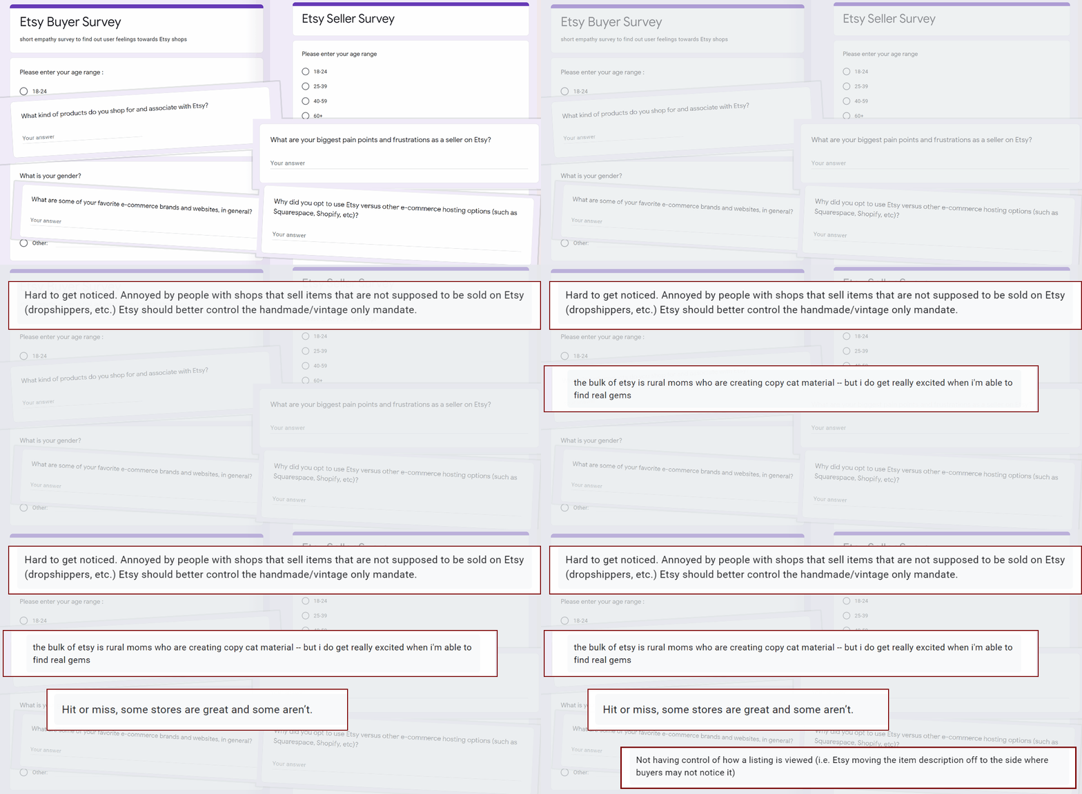
III. DEFINITION & IDEATION
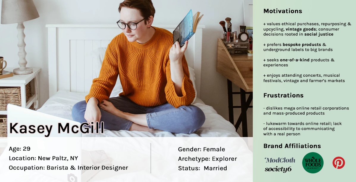
Our users are motivated by unique and one-of-a-kind products. They are more inclined to shop locally and favor more personable interactions with a business. Buying from a local artist feels like supporting a neighbor or friend.From the research I gathered, I was able to craft the following user persona:
USER NEEDS
Kasey finds it is easy to forget a specific Etsy shop name when all of the stores live under the same look & feel. It's hard to get a personalized feel for businesses that are on the standard Etsy model.Furthermore, it can get overwhelming to see such a large volume of stores & products. On the stores themselves, each site is a one-pager and it can be tedious to browse and to process information visually.
STAKEHOLDER NEEDS
Using Etsy’s default storefront model and marketplace seemed to be watering down the specifically unique brand and voice I wanted to cultivate and communicate across to our audience. There is also the risk of higher bounce rates with the presence of so many competitors in the immediate visual vicinity of a specific shop.How might I maneuver away from this standardized look & feel of the shop and strike a more resonating & memorable presence within target users?
PLAN ANALYSIS & RECOMMENDATION
To migrate into a standalone storefront website, I evaluated the following proposals: Etsy Pattern, Shopify, and a self-hosted domain.
EtsyRun traditional storefront within Etsy's UI |
| Listing fee: $.020 per item / 4 months. 5% on every purchase. 3% + $0.25 on every purchase |
| Limited storefront customization - stores are boxed into Etsy's overarching UI
Etsy Pattern exists for additional $15//month with ~10 more unique template options |
| Etsy Analytics (in-house) |
| ~$122-245 a year* |
| Cost: LOW |
| Level of effort: LOW |
|
Lowest seller fees. Low barrier of entry and learning curve.
Limited customization options for UI design. Oversaturated marketplace can lead to larger competitor pools, higher bounce rates/abandoned shopping carts, and reduced brand impact |
Shopify BasicHost store within Shopify Basic plan, use domain + premade theme |
| Basic plan = $29 / month |
| More storefront UI customization: 100+ free/premium designed templates available.
Potential risk of looking too much like other shops built with Shopify |
| Shopify Analytics (in-house) |
| ~ $348 a year |
| Cost: HIGHER |
| Level of effort: LOW |
| More customization, lots of professional looking themes. Can host on your own domain as a standalone website. Comes with Analytics
Still constrained to UI of templates. Higher costs. |
Self-hosted siteCreate entire store from scratch, including POS on backend |
| Hosting: ~$2-10/month + Addtl cost of externally resourcing POS system to be engineered on backend (expensive, est. several thousand dollars) |
| Complete freedom with UI design - sky is the limit.
Need to outsource external dev work (very expensive!!) |
| Up to you - can use Google Analytics, HotJar, etc. |
| ~ $120-240 a year + additional dev cost (high) |
| Cost: HIGHEST |
| Level of effort: HIGH |
|
Full fledged freedom and ownership of UI design & analytics methodology.
Engineering work to build a POS from scratch will be very expensive and may be overkill & ineffective use of resources for what we are trying to accomplish. |
RecommendedHybridself-hosted HTML site + Shopify Lite CDN integration |
| Approx ~$2-10/month for static web hosting + $9/month for Shopify Lite |
| No need to outsource dev work as front-end can be done with basic HTML/CSS/Javascript. Shopify Lite to secure facilitate purchae touchpoints Still have freedom with UI design. |
| Up to you - can use Google Analytics, HotJar, etc. |
| ~$138 - 228 a year |
| Cost: LOW-MODERATE |
| Level of effort: MODERATE-HIGH |
| Full customization and freedom with UI & traffic analytics.
Shopify Lite is simple and inexpensive way to integrate purchase functionality with a little elbow grease & creative application of jQuery |
IV. CODING THE SITE
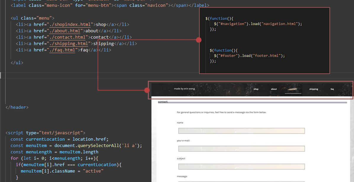
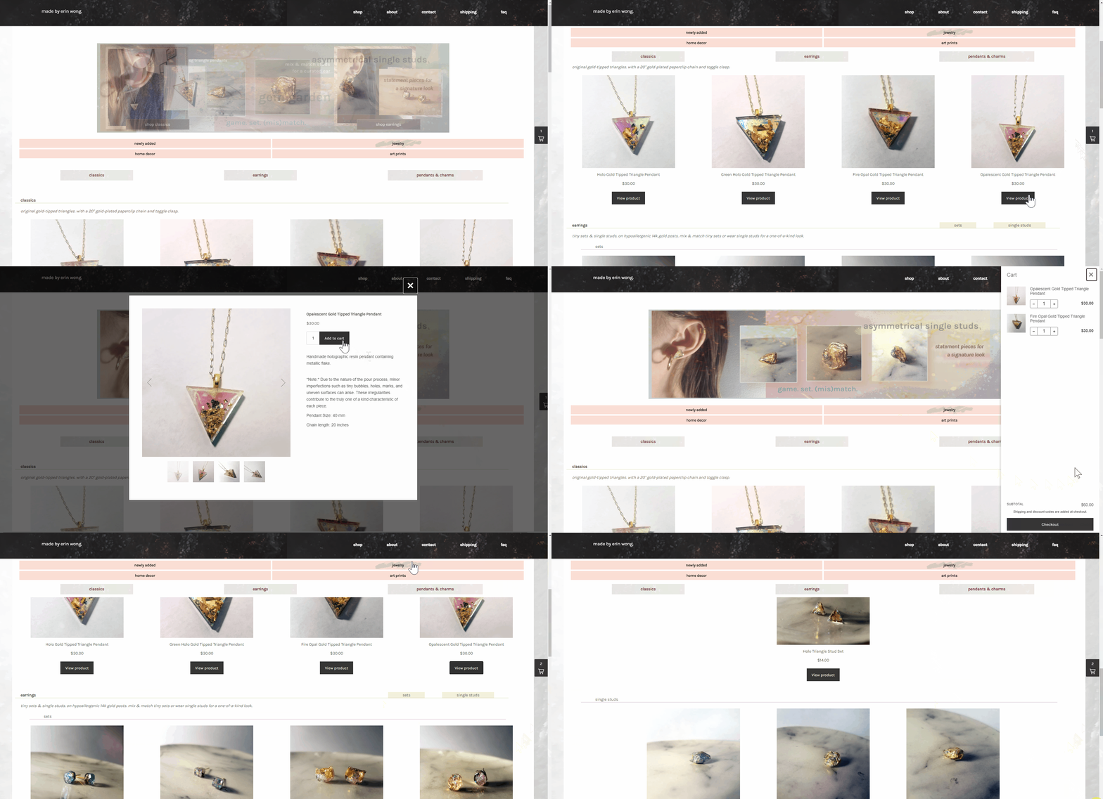
By using jQuery load() or PHP to return data into a selected element, I was able to mimic 'component states' created in prototyping tools like Adobe XD or Figma. Changes to the root html file would reflect on all pages without having to manually edit each and every individual page.
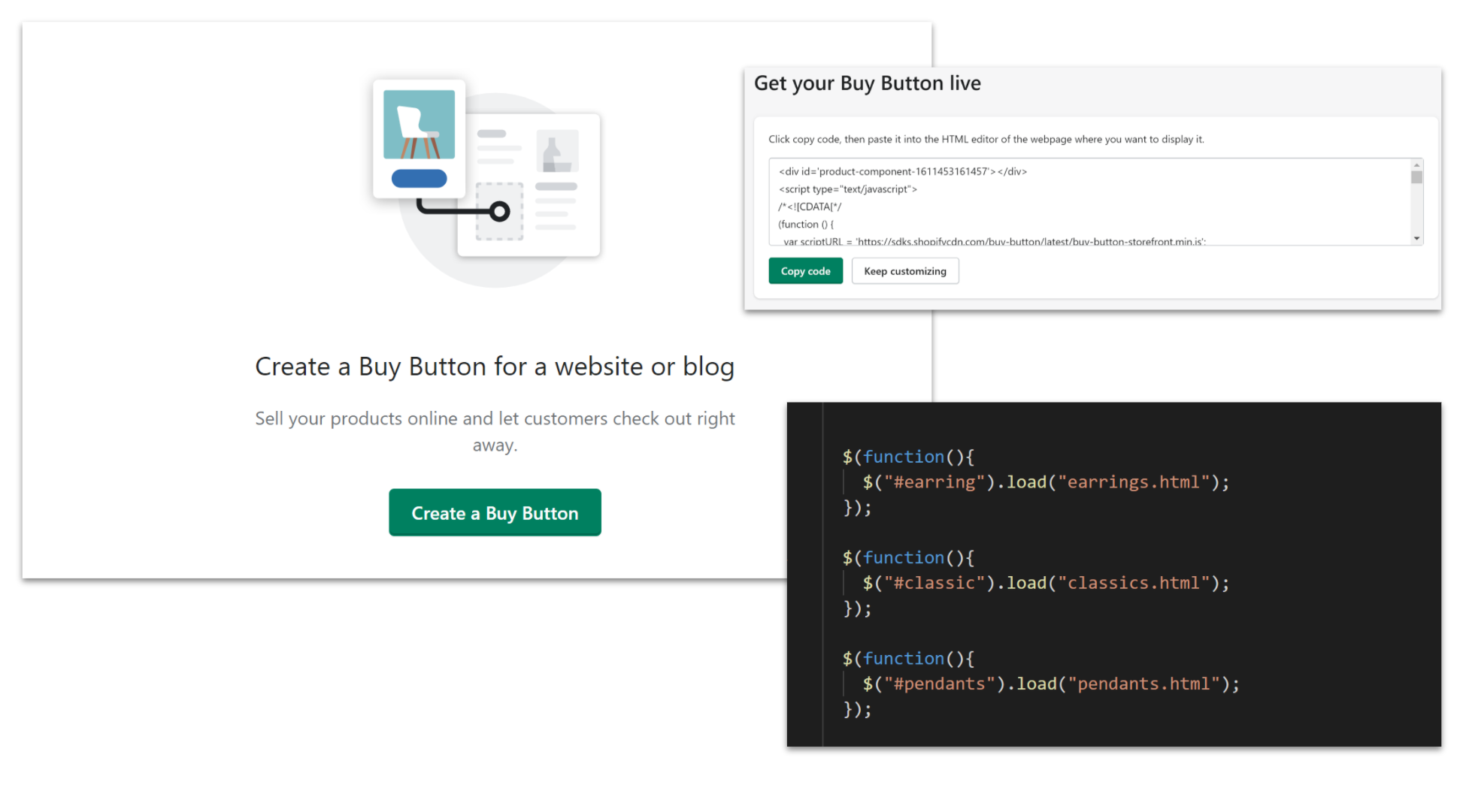
I integrated products and full purchase functionality by generating the embed button code from Shopify Buy Button and injecting into the page layout with a similar method.
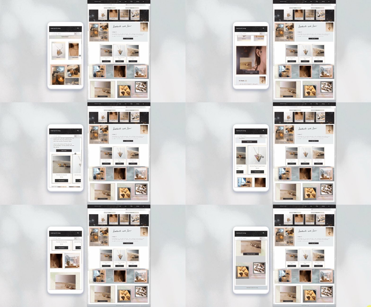
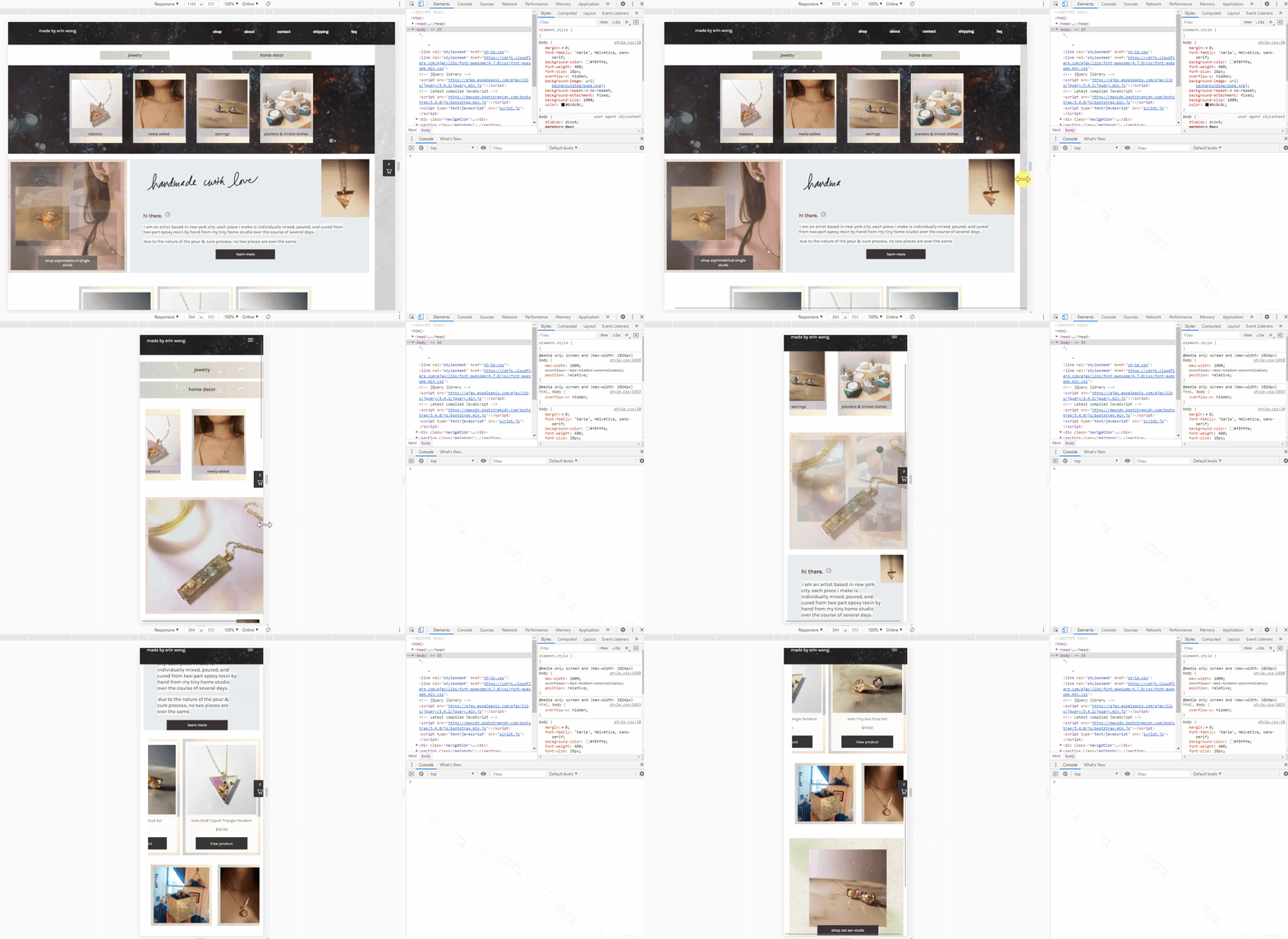
MAKING IT RESPONSIVE WITH CSS MEDIA QUERIES
VI. FINAL PRODUCT: LIVE SITE
KPIS & PERFORMANCE BENCHMARKS
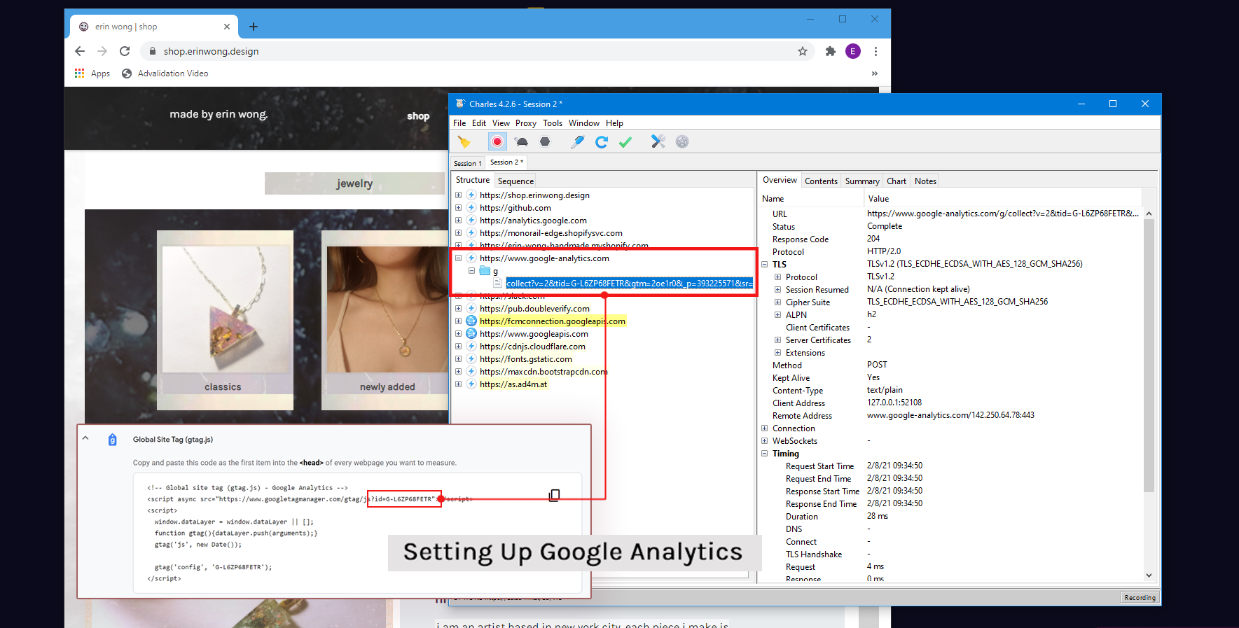
I installed Google Analytics to my site by manually embedding the tracking tag within the HTML. I ran a session in Charles Web Debugging Proxy to confirm that the tag was firing correctly on the page.