Mappetizer
Travel App Case Study#UX UI #mobile app #design thinking
I. INTRO
Travelers are underwhelmed by the lack of connectedness and authenticity that come with standard tourist destinations and the ways they might represent places and people.
Mappetizer is a travel food app that provides compelling user-generated content and allows for users to explore & match with local residents to share meals with, breaking cultural barriers through the shared language of food.
UX designer (individual project)
II. USER RESEARCH
PROTO-PERSONA
INTERVIEW PLAN


INTERVIEW FINDINGS
SURVEY DATA
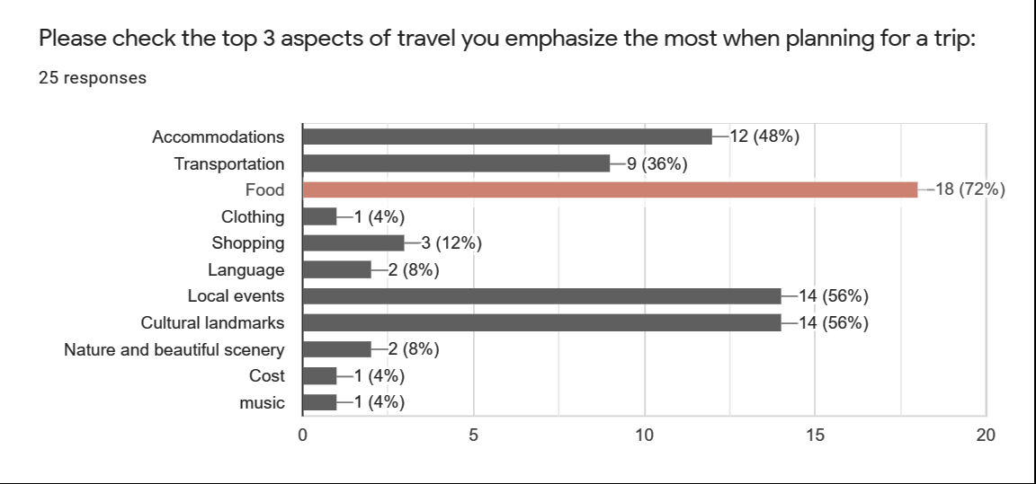
72% of respondents indicated that food was a top priority when planning for a trip.
73% of respondents reportedly engage in cultural & gastronomic activities the most when traveling, followed by nightlife & socializing.
Our participants consider themselves backpack/budget & active adventure travelers.
The majority of survey respondents indicated that being with someone who knows the lay of the land & having mobile data/wi-fi access at all times would give them a sense of safety & security the most when traveling.
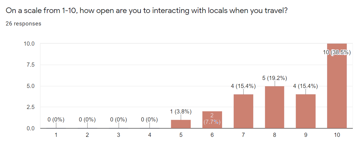
All respondents were moderately to extremely open to interacting with locals when they traveled.
AFFINITY DIAGRAM

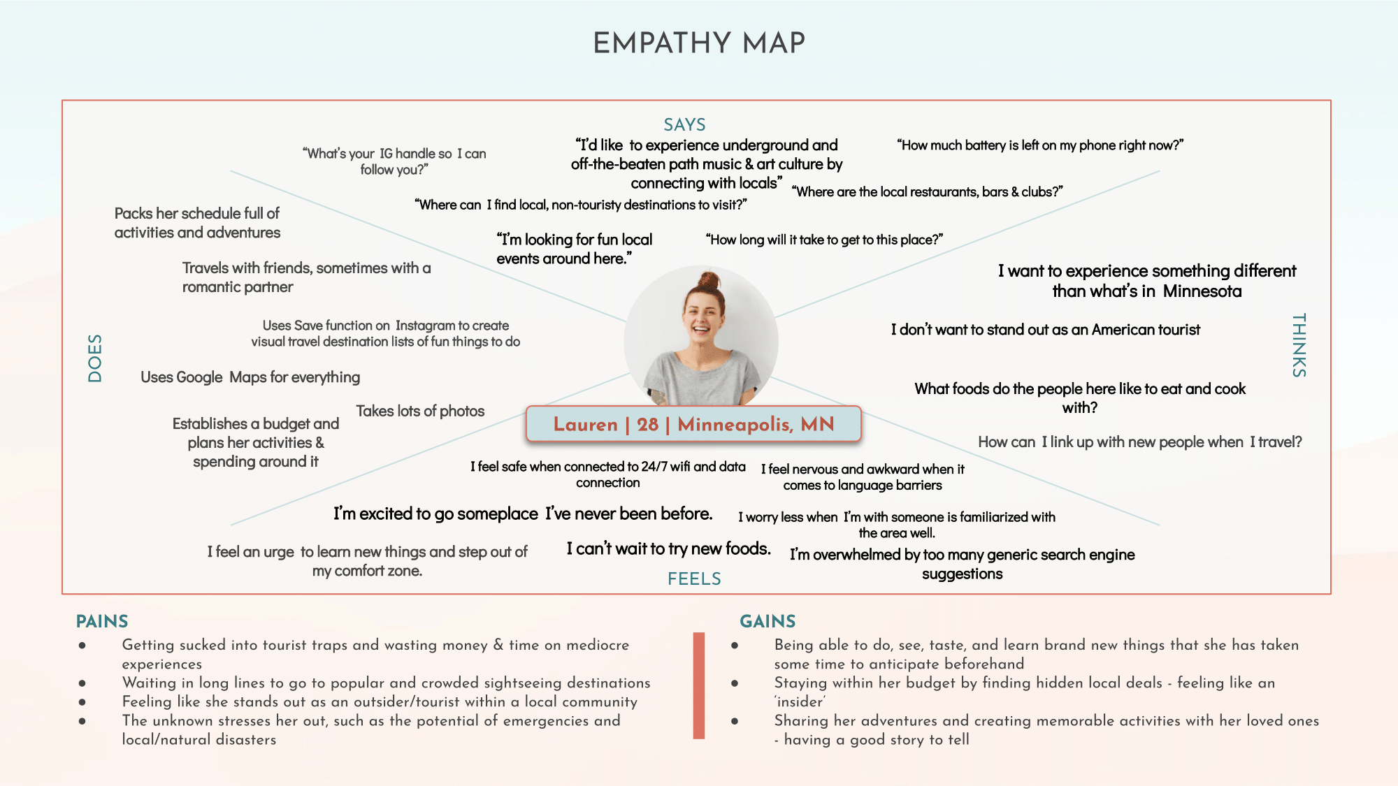
EMPATHY MAP
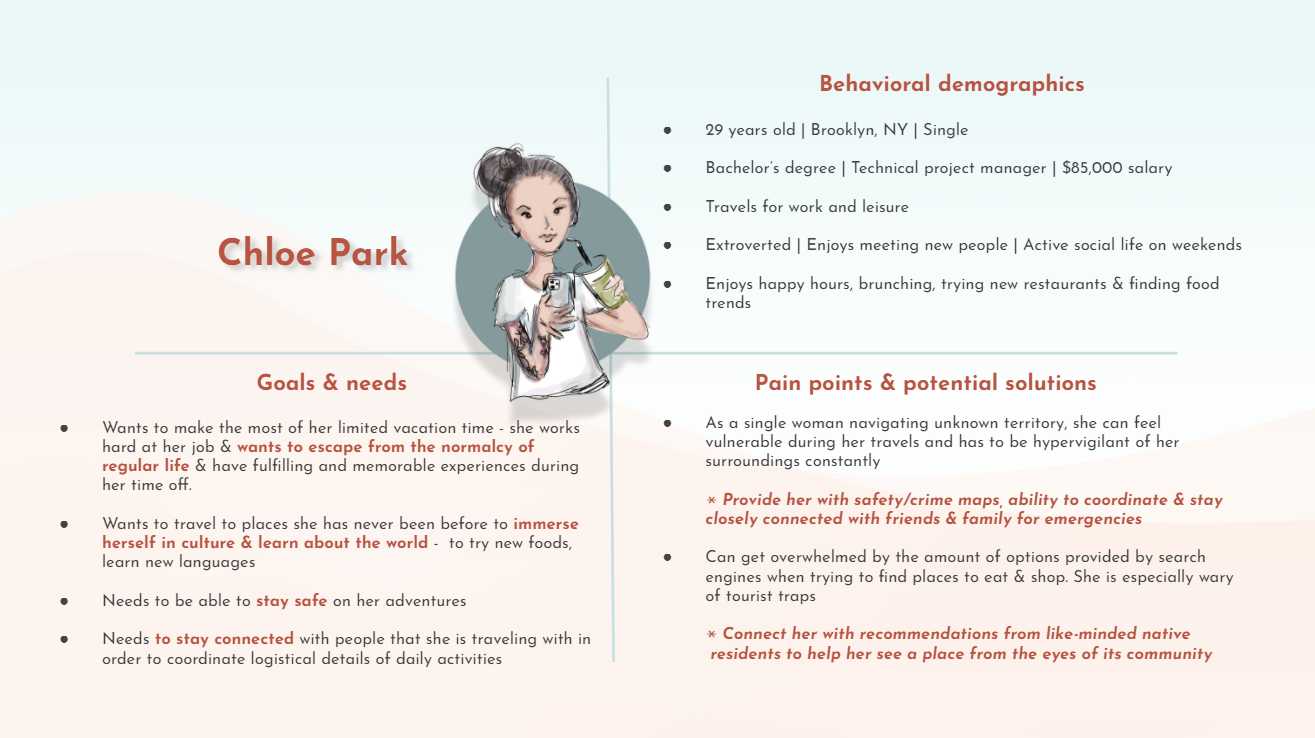
USER PERSONA
Building off our established research findings and empathy map, I created the following persona.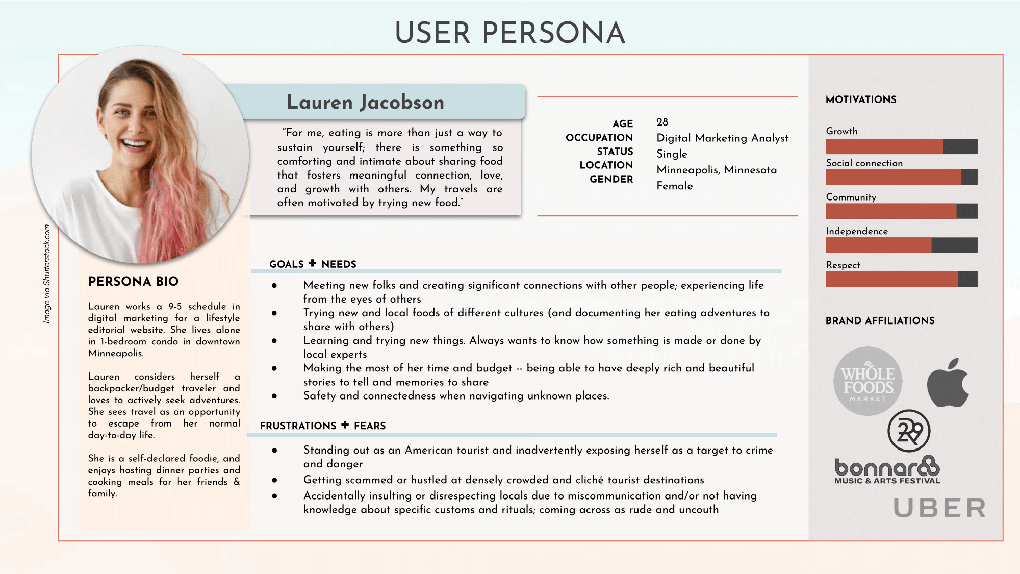
III. DEFINITION & IDEATION
USER INSIGHT STATEMENT

Doing so will allow her to broaden her personal horizons, move her to establish empathetic connections with people who are different from her, and help to dissolve ethnocentric views of the world around her.
PROBLEM STATEMENT
These experiences, while not necessarily outwardly fraudulent or deceptive, leave travelers disappointed and wanting more for their time and money.
Our users are motivated by curiosity, empathy, and respect for different peoples. They seek to personally connect and make meaningfully real memories & relationships with the places they travel to.
VALUE PROPOSITION


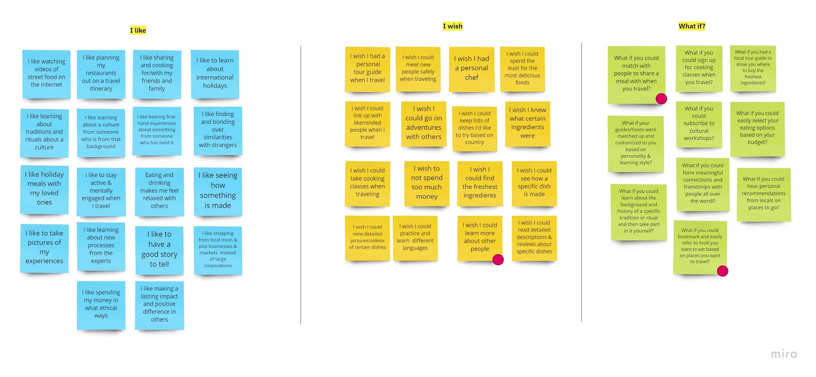
I LIKE, I WISH, WHAT IF IDEATION
USER SCENARIO

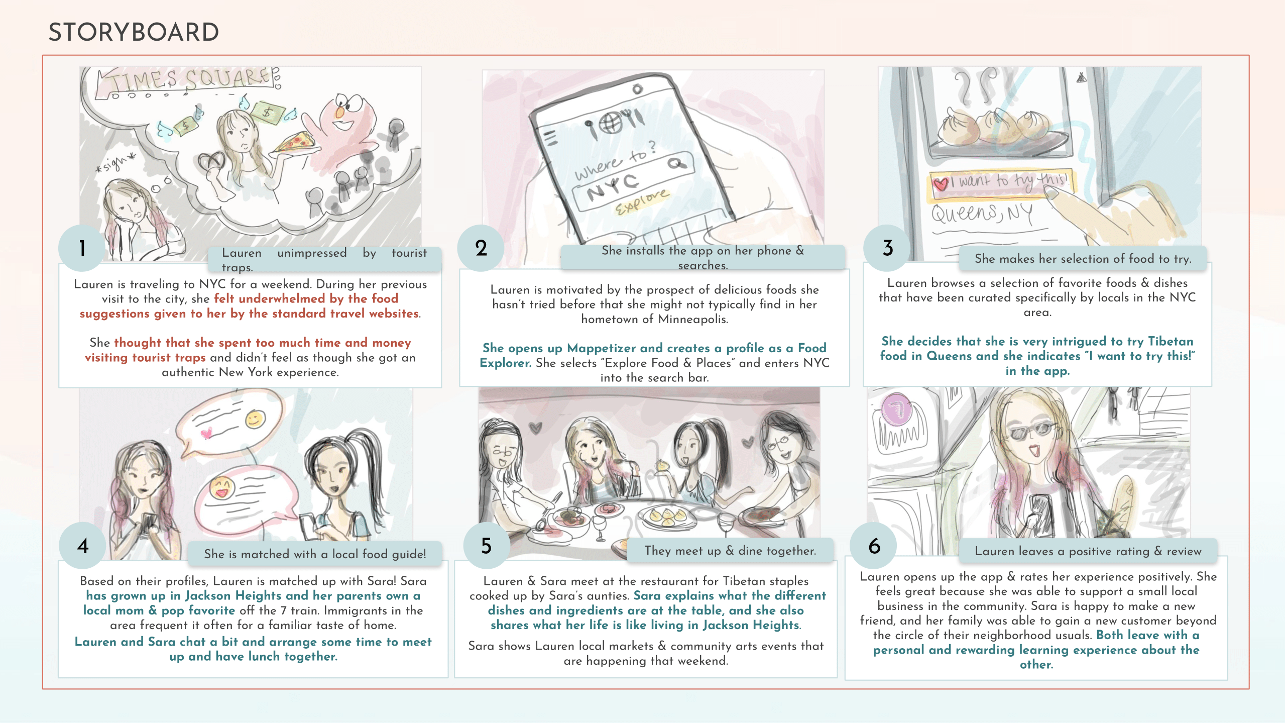
STORYBOARD
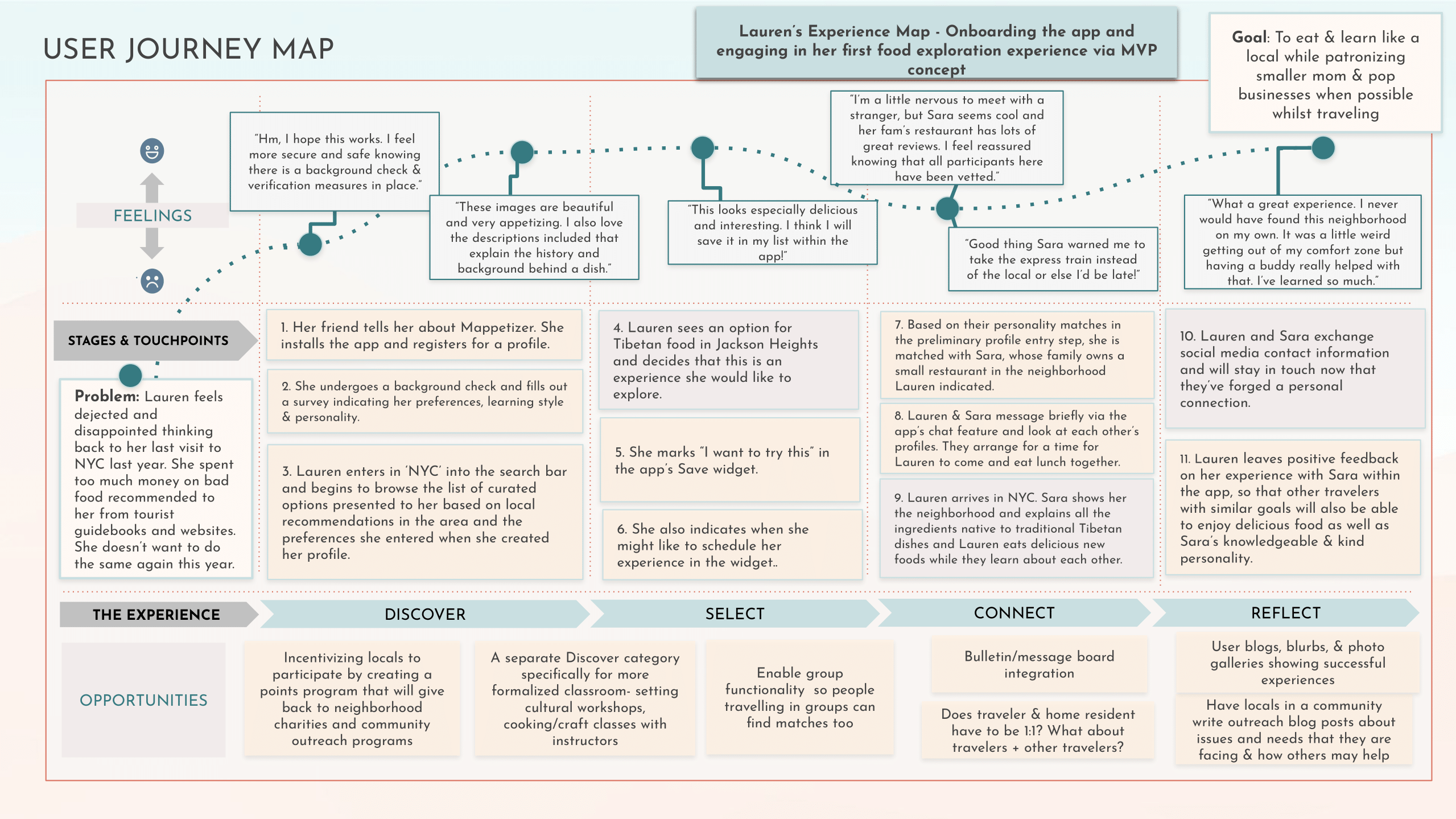
USER JOURNEY MAP
COMPETITOR ANALYSIS

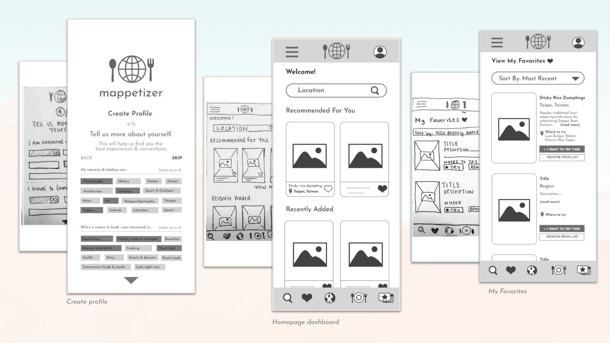
SKETCHES

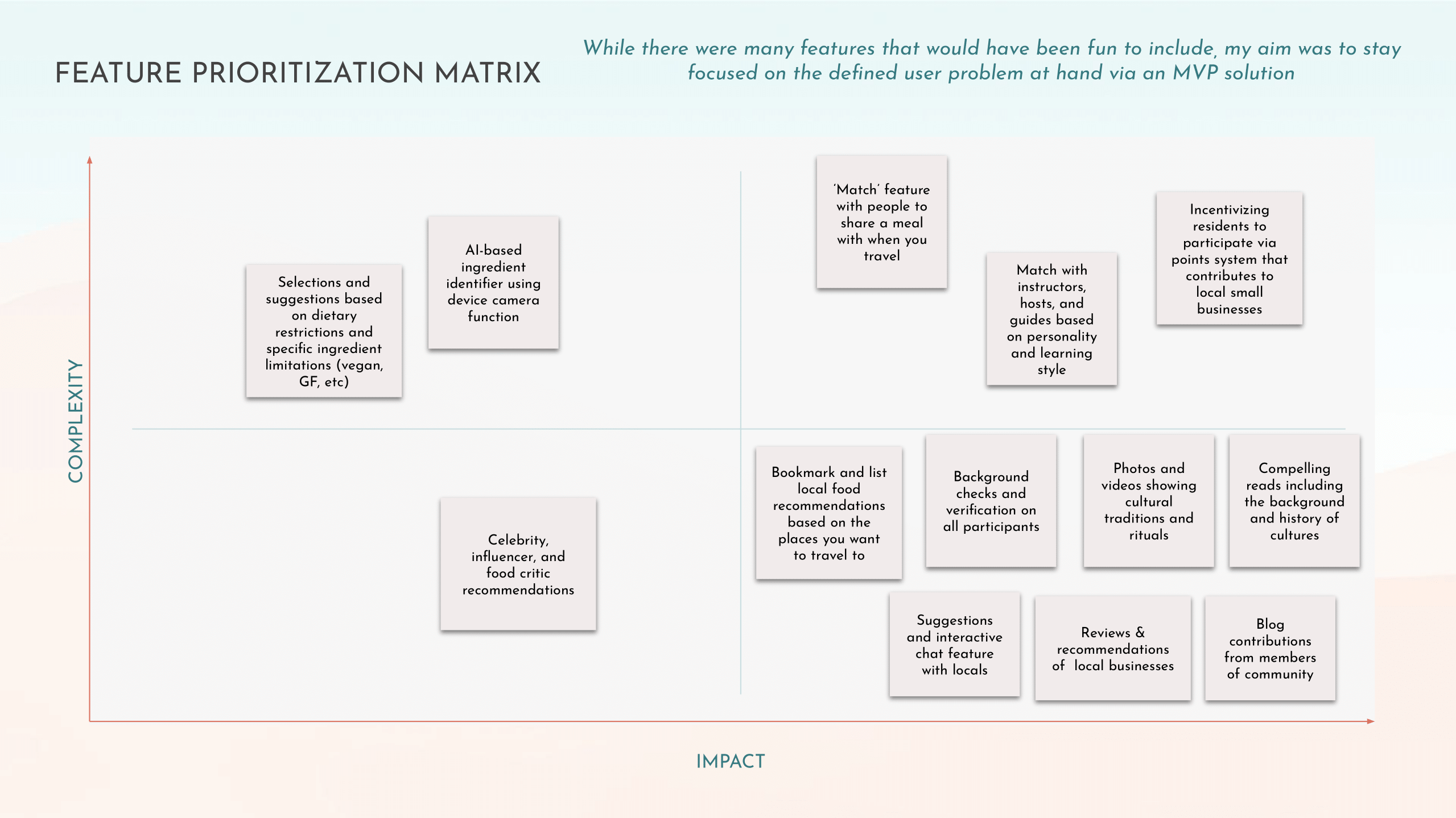
LO-FI WIREFRAMES
V. TESTING & ITERATING
GUERILLA TESTING PLAN
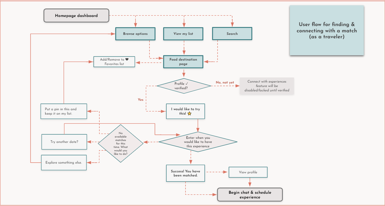
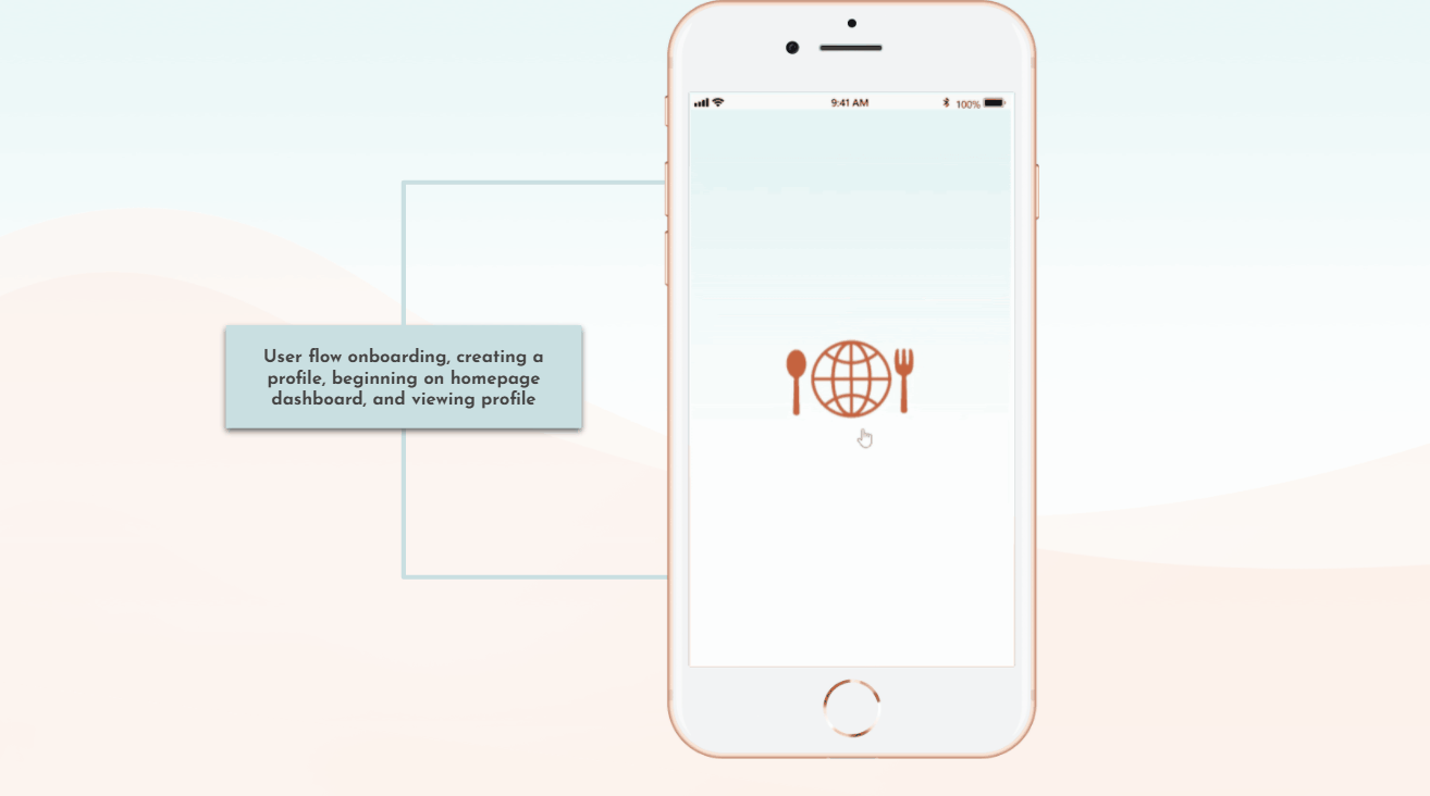
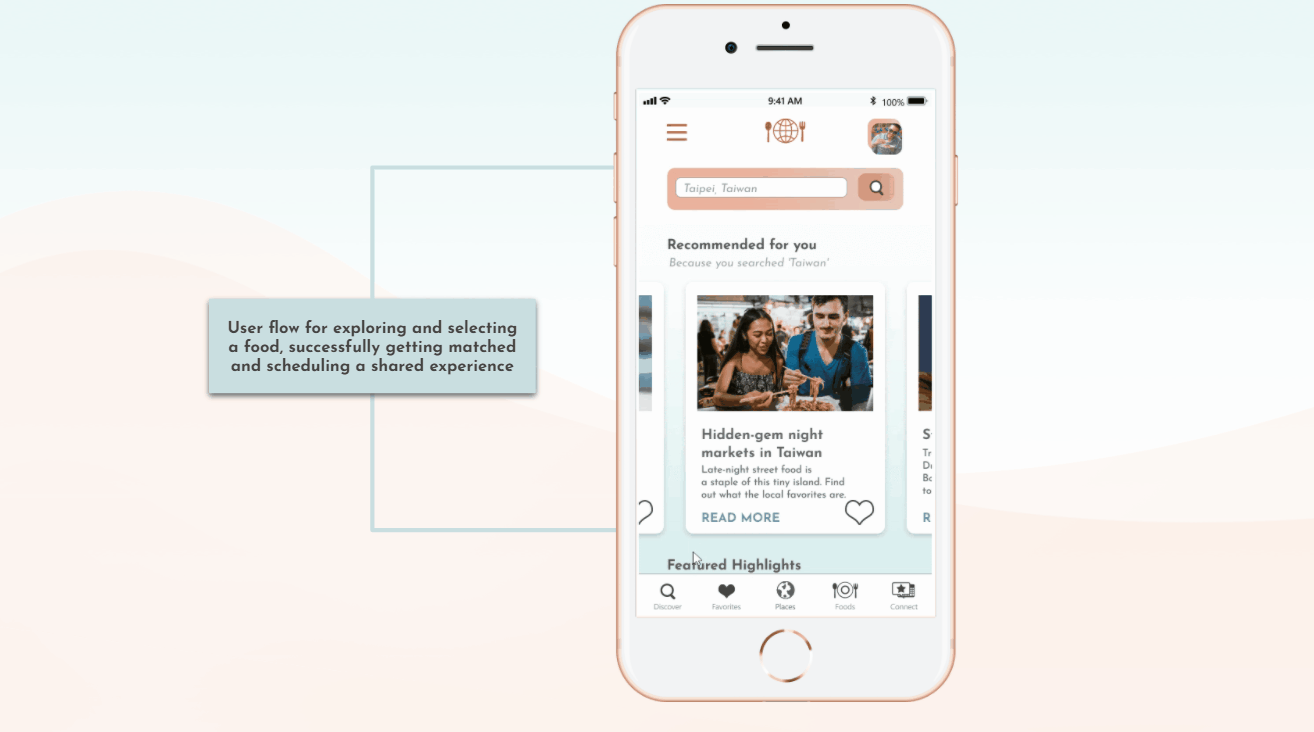
Identify usability obstacles of Mappetizer mobile in-app experience, from onboarding & creating a profile, selecting a food choice, and finding & connecting with a match
Millenial aged (22-38) people who use smartphones whilst traveling.

Register and create a profile.

Add a page to "Favorites"

View my list of Favorites

Get matched with local

Begin chat with match
TESTING FINDINGS (KEY QUOTES)
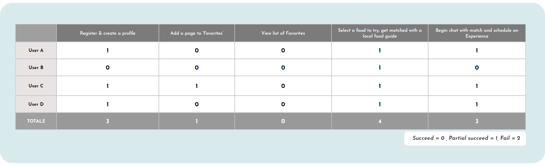
TESTING RESULTS
TESTING LEARNINGS & TAKEAWAYS
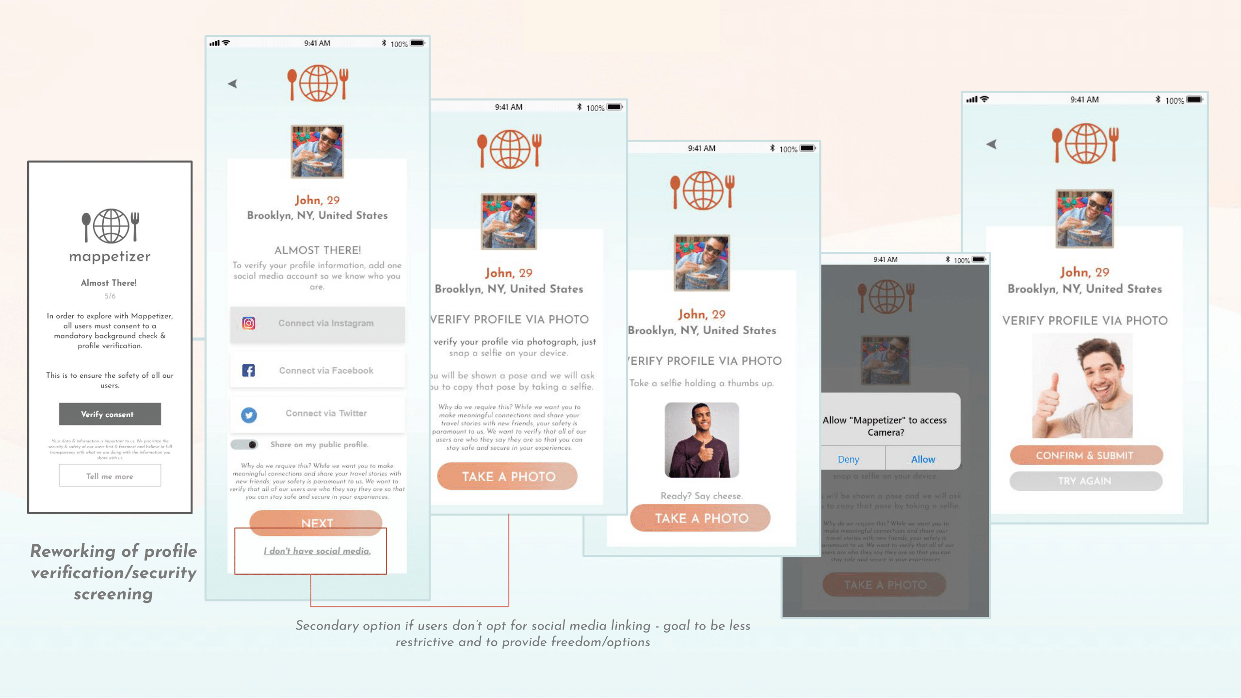
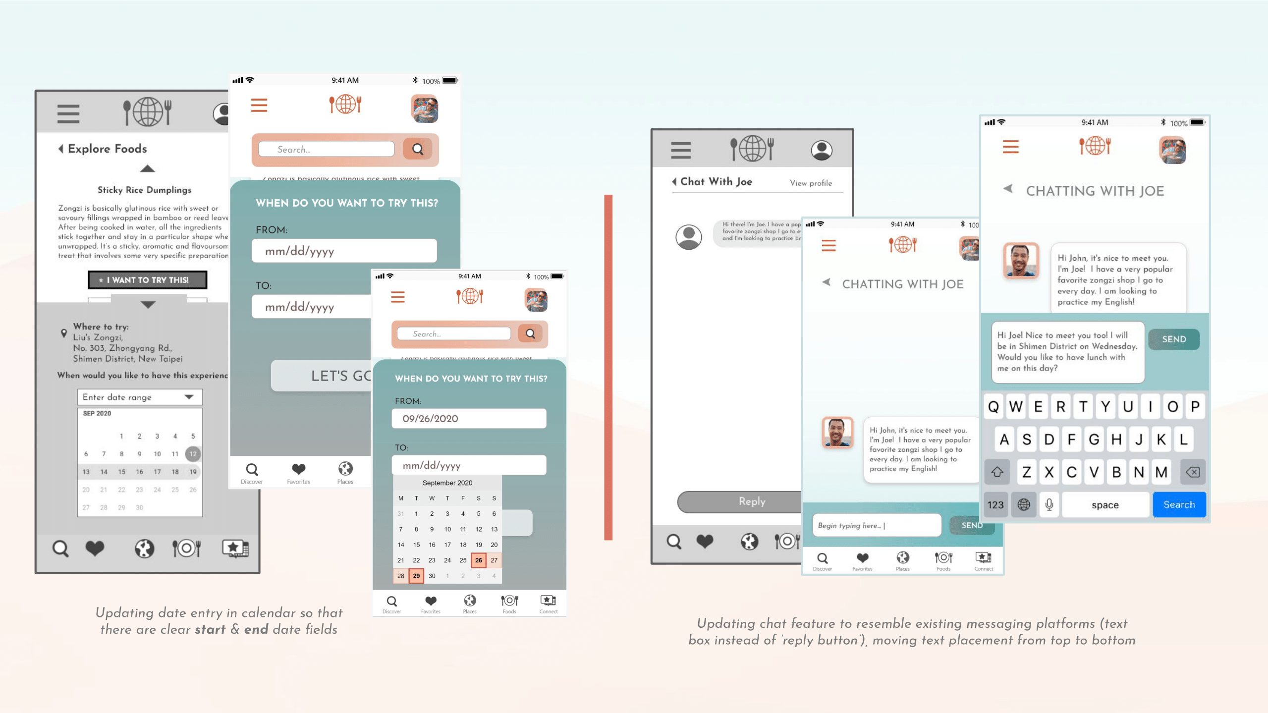
ITERATIONS
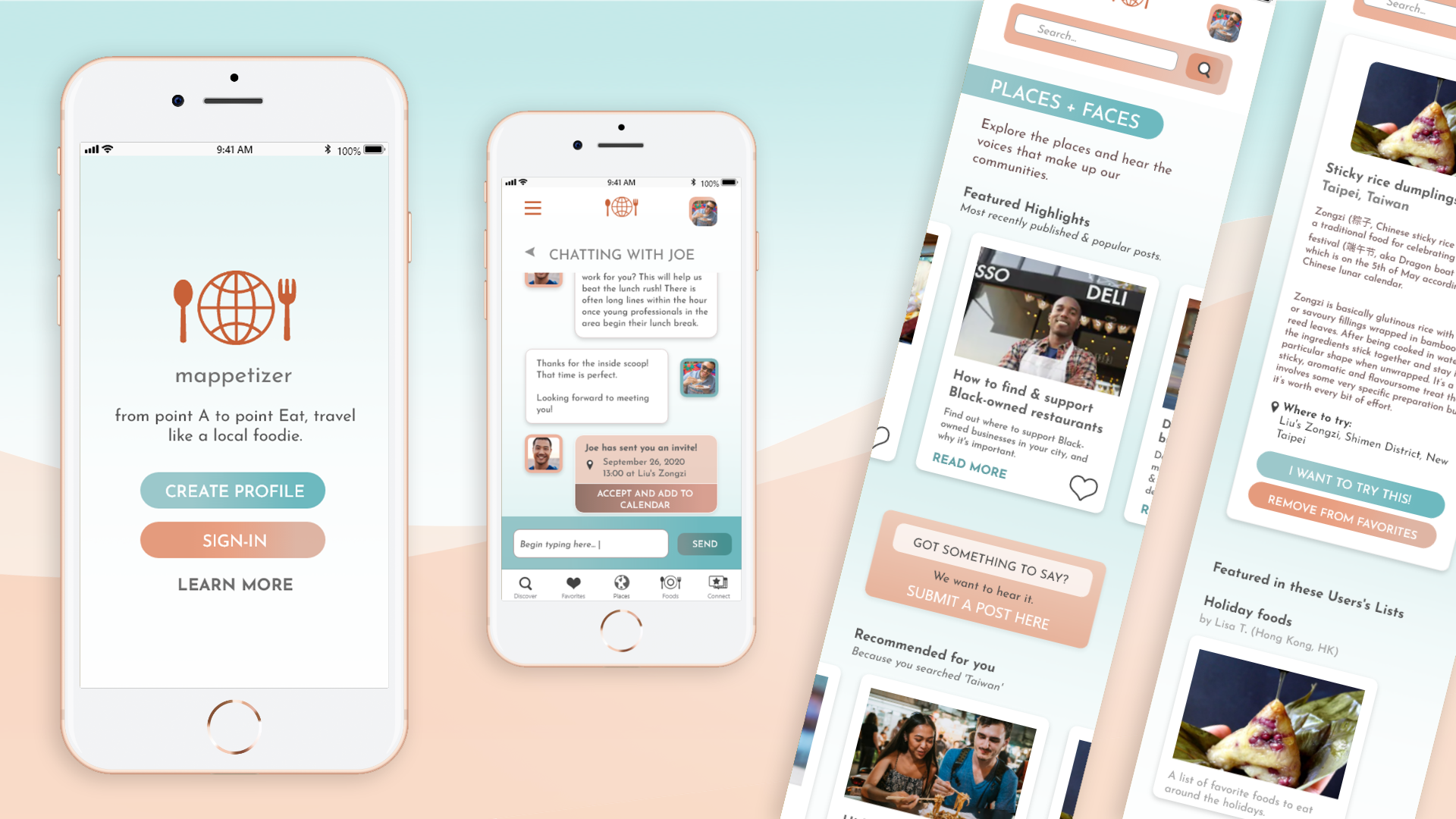
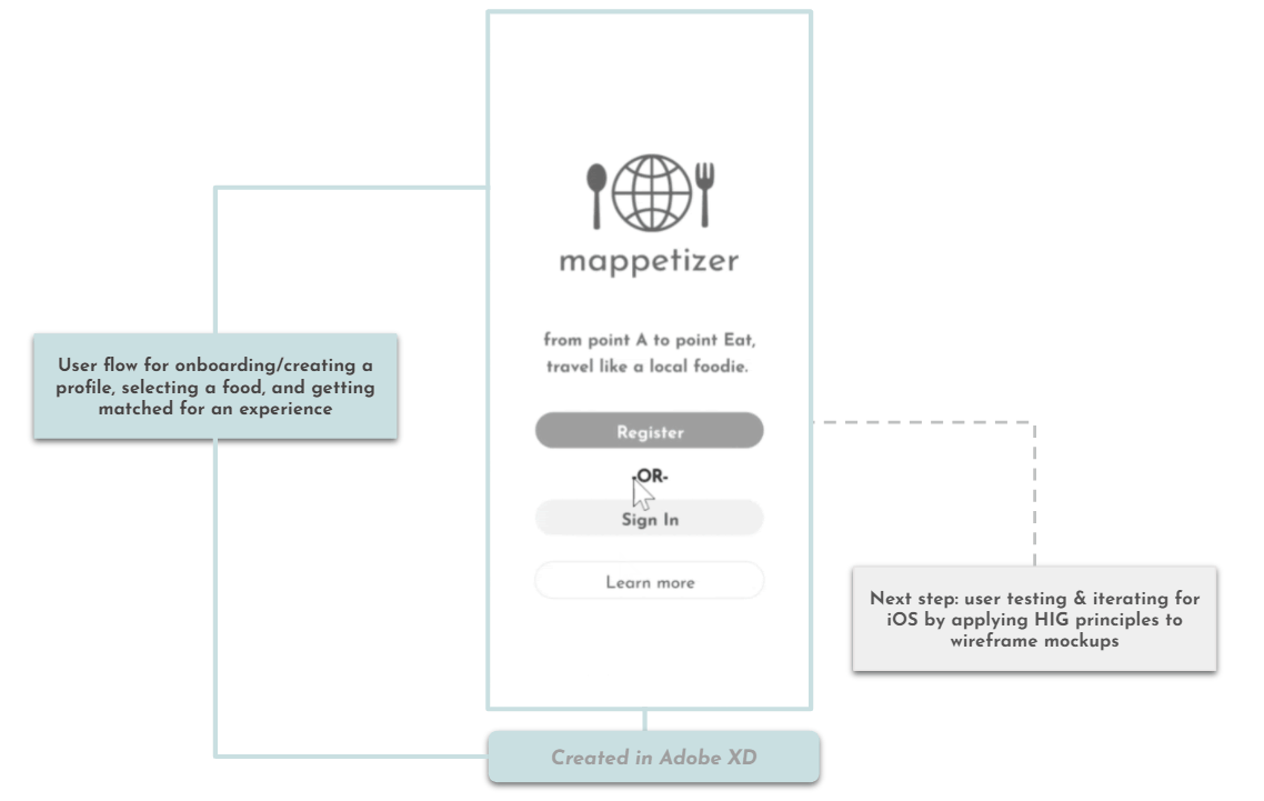
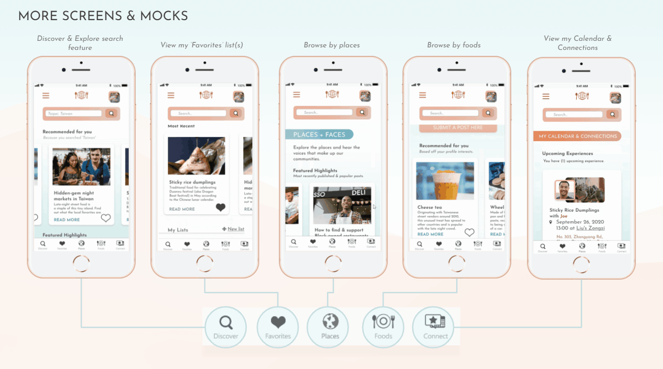
HI-FIDELITY iOS INTERACTIVE PROTOTYPE

VI. FINAL THOUGHTS
I learned each of these design thinking stage’s inherent value and how one is inextricably connected with the others when it comes to being able to prop up the final result (that is, if there ever really is a culminating end result, as I’ve learned that there is always room for further improvement).Moving forward, I would like to engage in further rounds of testing, iterating and critique in order to come closer and fully flesh out a solution that filled in the needs established in our initial problem. If my app were ever to be released into the real world, I would also like to establish quantifiable metrics and KPIs that would define and evaluate what successful performance looks like in order to substantiate & drive each design decision within it.
View the interactive prototype below: