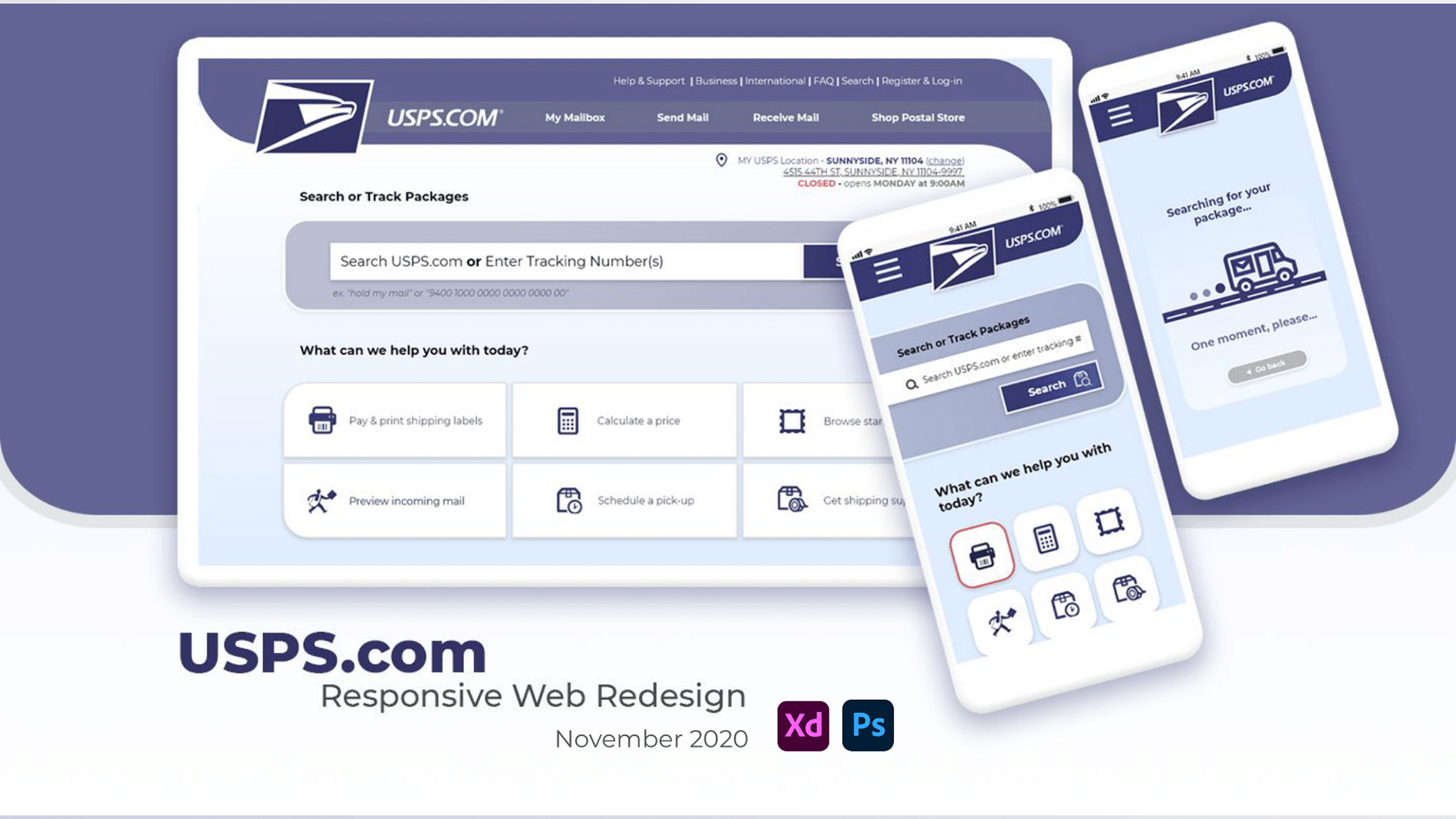
USPS Redesign
Responsive Web Design Case Study#UX UI #accessibility #responsive web
I. INTRO
OVERVIEW
USPS.com’s purpose is to foster an online presence for local United States Post Office outposts and to facilitate customer service exchanges that take place in physical office locations. Its target user base is rooted in public consumers who are looking to manage their personal/business mail transactions via interactions such as creating shipping labels, purchasing postal products, tracking mail & packages, and receiving estimates based on destination and time, at both an individual and business scale.
CHALLENGE
The audience base that USPS.com serves is as wide and varied as the United States population itself. There is no ‘typical’ USPS user so much as there is no one defined, typical American.
As a federal agency providing a basic service to the gamut of the entire country’s population, its website needed to be easily maneuverable and accessible to an enormously diverse pool of users -- ranging from all levels in technological savviness, language fluency, and general understanding of how the postal service works.
GOALS

With this in mind, my goal as a UX designer was to create a responsive redesign for USPS.com that understood the breadth of its customer base and was widely usable with as little learning curve or intimidation as possible.
I aimed to fully comprehend what common behaviors and and shared characteristics lay beneath the needs of its site’s users, despite physical, cognitive, & sociocultural differences that spanned between them.
I sought to do this by breaking down the current website design via heuristic evaluation and analysis, and by conducting interviews and testing sessions in order to understand underlying mental models behind our users and to shape design decisions.
Web Style Guide, 4th Edition: Foundations of User Experience Design
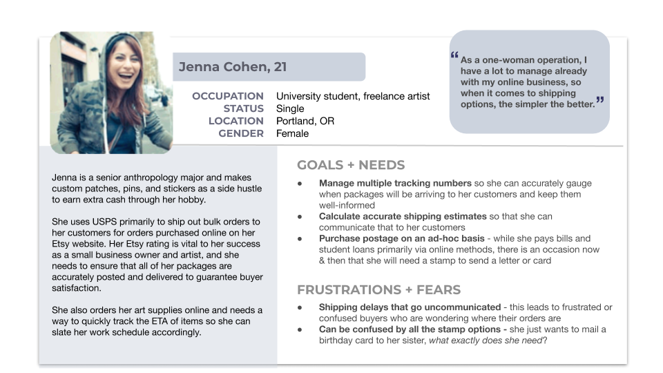
PROTO-PERSONA DEVLEOPMENT
Considering these assumptions about our user base, I crafted two proto-personas with vastly different identities; but both had some basic needs to be fulfilled via the postal service. How might they navigate through the site in order to achieve their respective goals?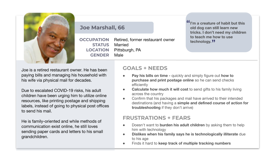
II. USER INTERFACE ANALYSIS & TESTING
USER PATH & WIREFLOWS, HEURISTIC EVALUATION, & ACCESSIBILITY ANALYSIS
I completed several preliminary wireflow annotation exercises in order to get fully acclimated with the user flows for some primary functions on the USPS website. By breaking down the details and analyzing each visual element as it was presented on the page(s), I began to evaluate its success in its current context, both within the page itself and its placement within the overall schematics of the site map.
Homepage analysis: bodystorming & general notes
.png)
.png)
Tracking: heuristic evaluation
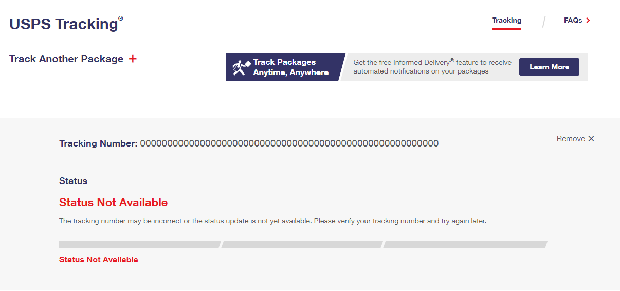
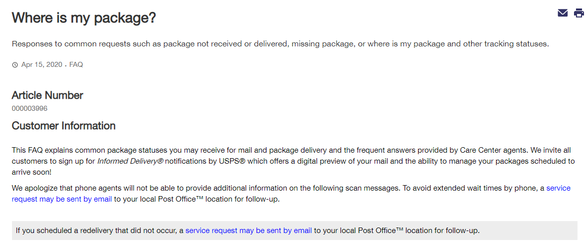
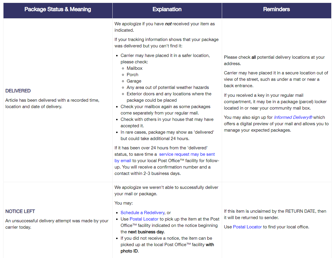
Is their tracking number way over/under the designated digit limit of the barcode? Did they accidentally add an invalid character? Is there an opportunity to integrate a QR code scanner to mitigate copy+pasting and/or manually entering numbers? Ought we place the FAQ link into the main body field instead of right-hand nav, in order to immediately orient users for further troubleshooting?
When troubleshooting where a package might be, the user is directed to a FAQ table.
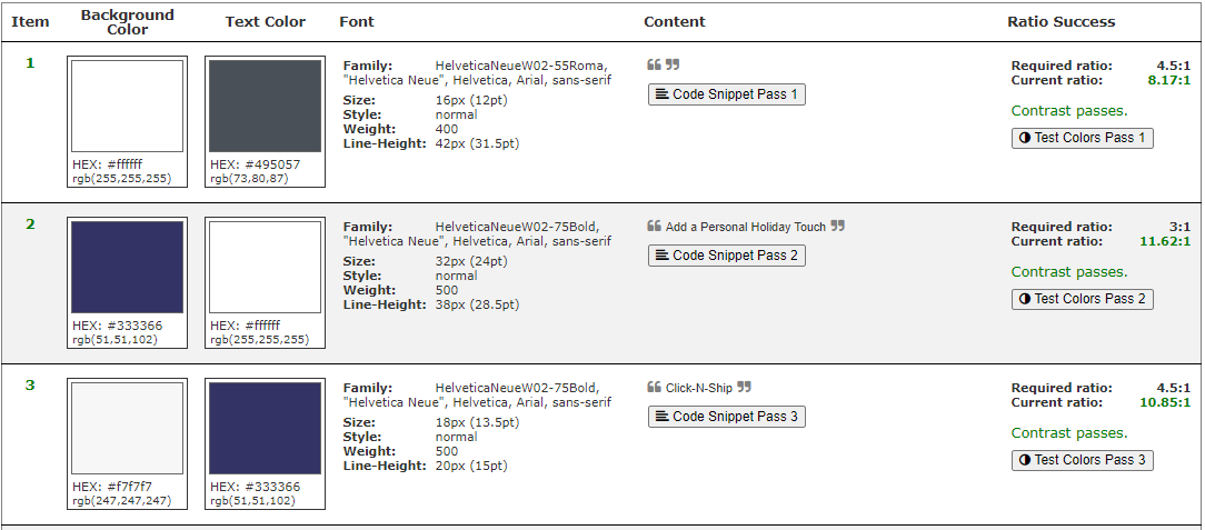
ACCESSIBILITY
A general accessibility analysis showed that, overall, the current USPS web design was successful in accommodating folks with disabilities, based on WCAG guiding principles dictating that web content ought to be perceivable, operable, understandable, and robust.

USABILITY TESTING


Participants were asked to execute tasks such as track a package, create a shipping label, and try to get a shipping estimate for a package considering time and destination.

Graphic Designer
Atlanta, GA

Student & Intern
New York, NY

Architect
Minneapolis, MN

Real Estate Agent
New York, NY

Teacher
Danville, VT

Marketing
New York, NY
The purpose here was to shed light on commonalities between success and frustration points that weaved these different folks together in their shared experience of navigating the site.

Icons provide a visual indication of what something might do, and the corresponding text will affirm & validate that speculation within the user’s mindset.
Multiple participants said that they would not know by icon or image alone what an action may represent.

This was a function I would later prioritize in my redesign, as it seems as though most, if not all, tested users communicated that its use was a fairly necessary one in their lives.
III. INFORMATION ARCHITECTURE
CARD SORTING
In order to better understand how an individual USPS consumer thinks and navigates through the information living within the site, I facilitated 4 closed card sorting exercises.
This allowed me to substantiate each page’s placement within our developing information architecture, ensuring that our design model matched the user’s mental model.

SITE MAP
With the insights discovered via user card sorting, I created a site map that users could comprehend and successfully navigate through.
Because we witnessed some user ambiguity during the card sorting exercise, I decided to place these pages within the primary navigation to eliminate categorical grey area.
Next steps of further testing will confirm the placement of these units and/or establish clarity on where they might best live.
LO-FI WIREFRAMING

IV. RESPONSIVE DESIGN, PROTOTYPING, & TESTING
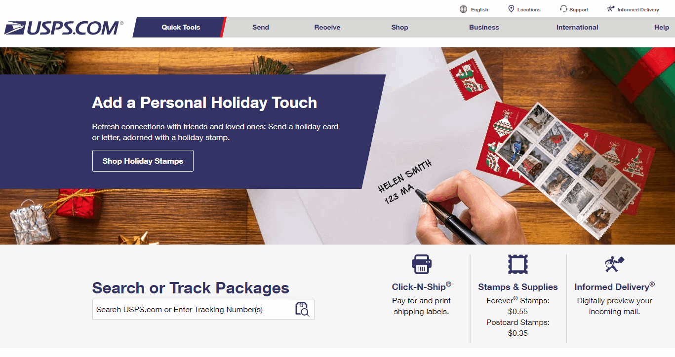
One particular change I applied from the original USPS design was to move “Quick Tools” from the top header navigation to a spot directly above the fold on the homepage, wanting to make this even more quickly & readily available at the fingertips.

I distilled this further and reduced the number of options that were available in Quick Tools in order to establish clearer user workflows and to not clutter the user with too many navigation patterns available to them when they were already on the fast track to their goals.


In this round of testing, I opted to test for tracking packages as the main task flow. For many users, this was their first touchpoint within the site and a main reason for their visit. Therefore, its success was critical.
While testing was generally successful for tracking, it raised the question:
...by applying these changes, we’ll ensure that users do not feel abandoned or frustrated at the apparent “end” of a workflow. The goal was to foster peace of mind and reassurance when they are already preoccupied with wondering where their packages are. By providing additional calls-to-action, we can give the user a feeling of control.

Because there are so many different ways that a user can travel throughout the USPS site, it became evident that there was a need to immediately orient the user and to keep them anchored no matter how far they wandered away from the homepage. I did this by adding in breadcrumb navigation.


When it came to the Tracking Status page, tested users said that they preferred to see time & date prominently presented when thinking about where their packages were -- if a package wasn’t delivered yet, when would it arrive? If it was delivered, how long was it sitting at the front door?
In consideration of the LATCH method of organizing information, I separated time & location as two distinct decipherable information points in order to aid visual digestion and present what the user cared the most about to the forefront of their eye.


IV. POST-MORTEM: FINAL THOUGHTS
While all the users tested for this project were English speakers, part of considering universal usability meant acknowledging users whose first language is not English. The 2019 Census Bureau reports at least 350 languages spoken across households in the United States.
On the USPS website, only two additional languages besides English - Spanish and Chinese - are available, and not all elements are fully translated.


As a potential next step, it would be a great opportunity to be able to create multiple language versions of the site that represented the scope of languages spoken by USPS consumers. Testing among native speakers of respective languages would deliver insight into the sets of visual cues and communicative signifiers that lie within each culture group itself. This could further help inform ease of use & delight for an individual user.

Prioritization was a challenge. Due to the limited time constraint of the project, I had to select a few task flows to focus on, rather than attempt to overhaul the entire site.
Because my intention was rooted in creating solutions that would hold significant relevance for as many people as possible, I prioritized the homepage navigation and tracking task flows, so I could cast as wide of a net as I could when it came to testing. My aim was to test people who had familiarity with these actions in their daily lives so they could offer meaningful qualitative data to build from.
Moving forward, I would likely approach this by continuing to work on most common use cases, and work my way back in terms of what needed to be prioritized by considering what is most applicable & relevant for the users.
That being said, because we have such a widespread pool of postal service users, this may not always be as clear as homepage navigation and tracking packages.
It would have been enormously beneficial to have access to large-scale quantitative data gathered internally within the site -- such as page view metrics, heat maps, and on-screen viewability rates. Coupled with the qualitative data gathered, this would be powerful in telling a bigger story surrounding the vast audience we’re working with.
Additionally, I would have loved the opportunity to engage with USPS stakeholders to understand their concerns and preferences.